

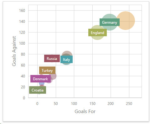
Scatter Chart in Dashboard
The Scatter Chart is a visualization tool used to display relationships between two numerical variables by plotting data points on a Cartesian coordinate system.
It’s ideal for identifying correlations, clusters, and outliers in the data.
More information can be found on the website of DevExpress (external link Scatter Chart).